Match the background to the image's job
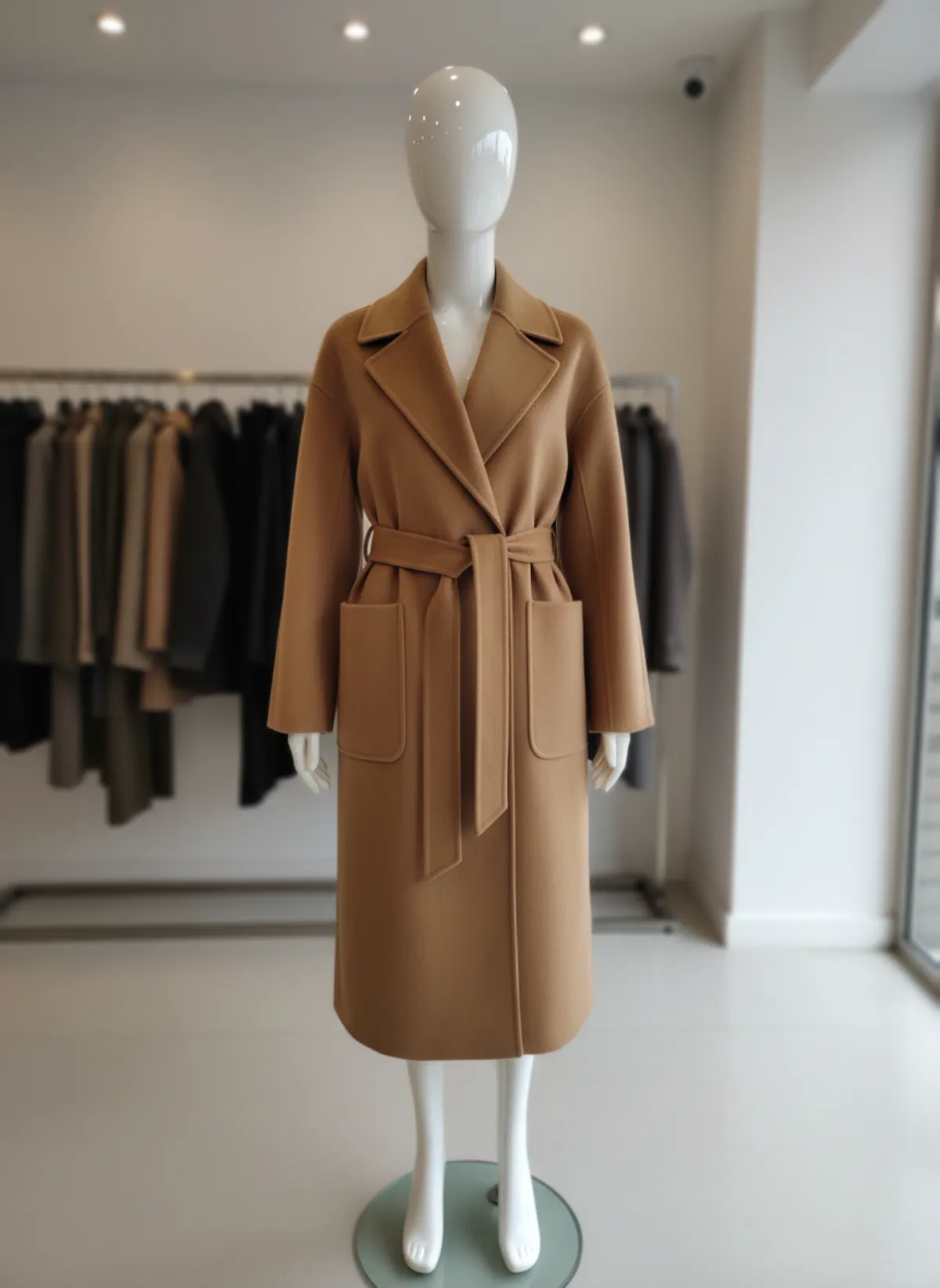
The lead product image should make recognition effortless. Shoppers need to identify shape, color and length while scanning a collection, so a white, off-white or light grey field is usually the safest starting point. It removes visual competition and makes adjacent SKUs easier to compare. Neutral does not mean careless: a slightly warm grey can separate an ivory garment that disappears against pure white, while a cool grey may flatter steel jewelry.
A colored background has a different task. It can encode a season, distinguish a collection or create the visual rhythm of a campaign. Pick it from the product palette rather than choosing an attractive swatch in isolation. Complementary colors create energy; neighboring colors feel calmer. In both cases, check that the background does not cast a colored reflection onto pale fabric, polished metal or patent leather and change what the shopper believes they are buying.
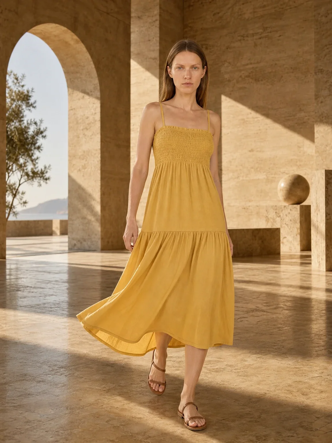
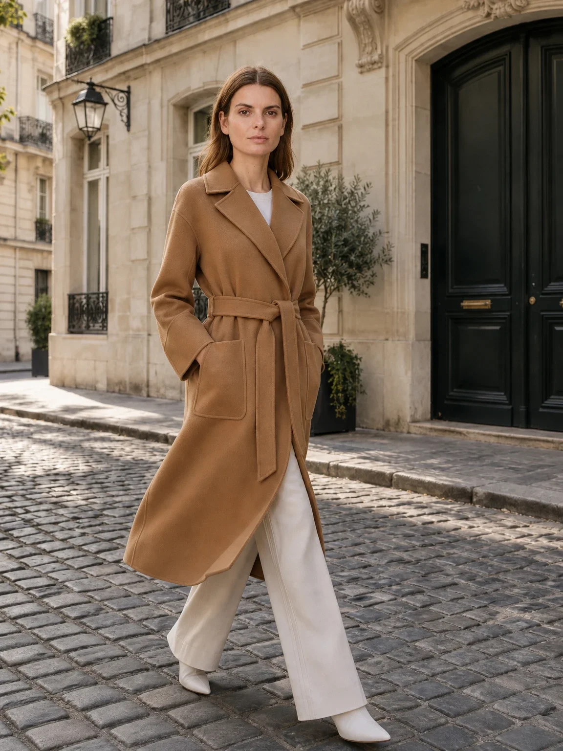
A lifestyle background answers questions a plain listing cannot: where is this worn, what scale does it have and what kind of person is it for? Use it after the factual views, not instead of them. A linen shirt in a coastal room can communicate mood, but the same shadows and props may hide its weave or hem. Pair that scene with a clean front, back and detail view from your core catalog system.
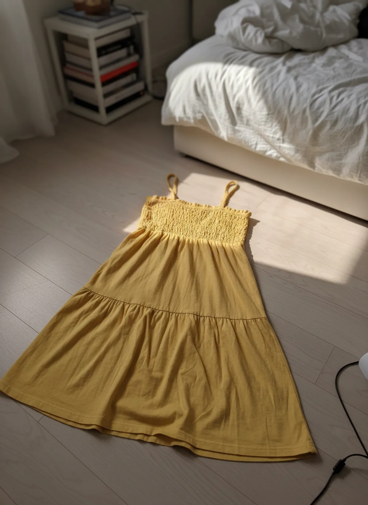
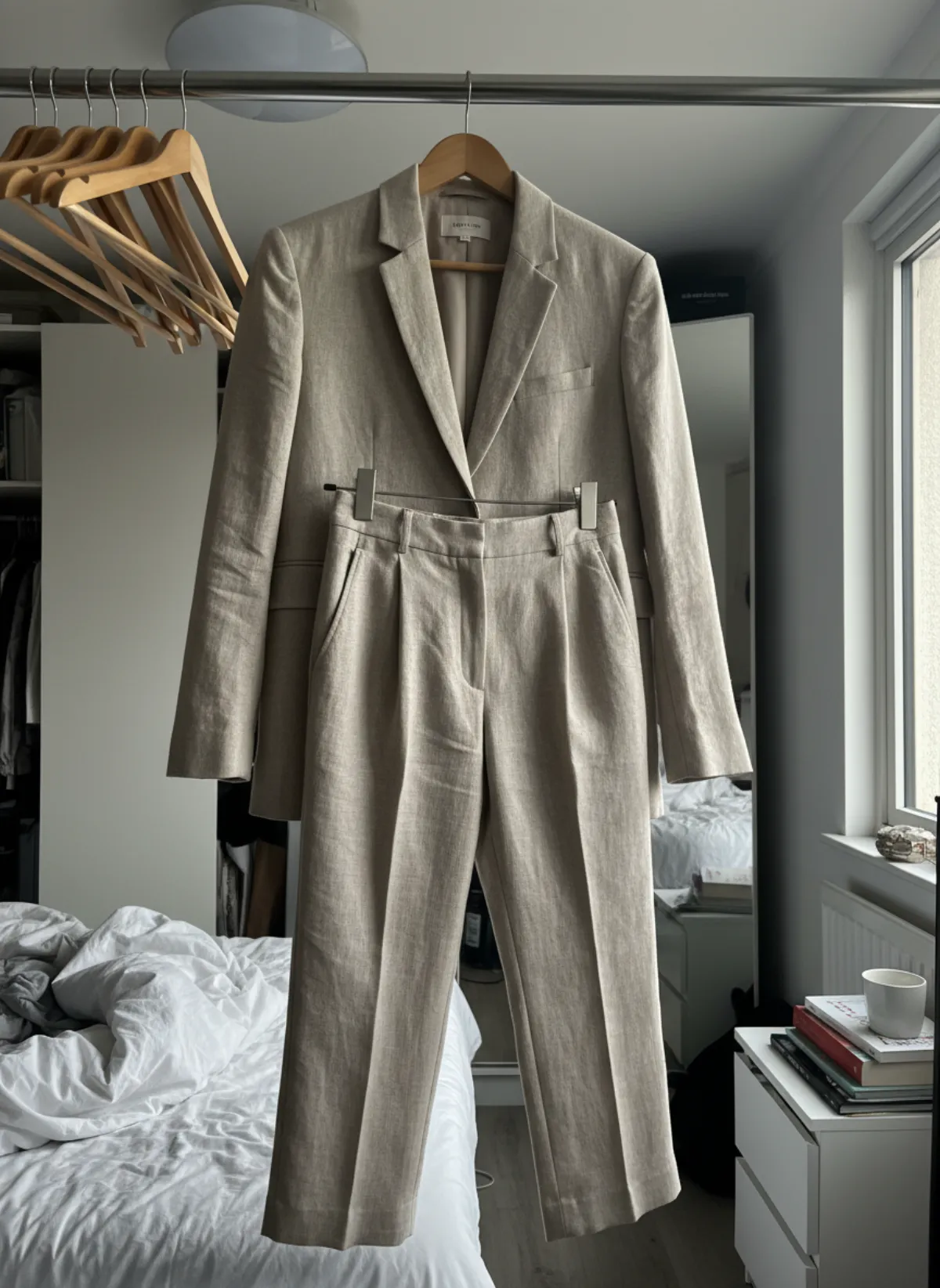
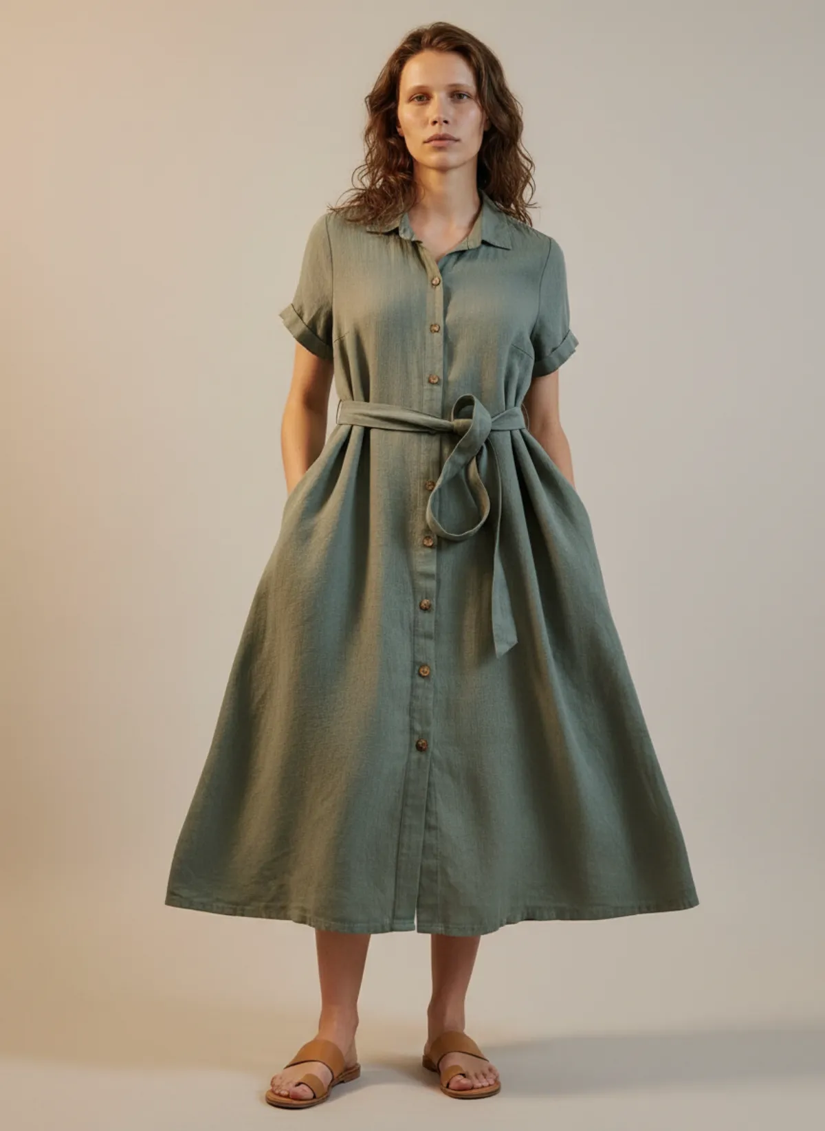
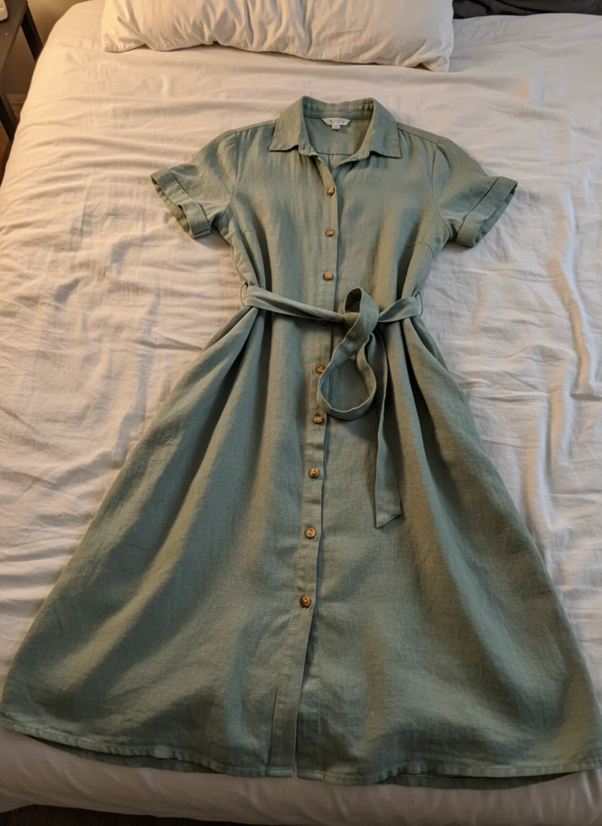
Think in a three-layer image set: evidence, context and persuasion. Evidence is the clean product or model view; context is the believable scene; persuasion is the campaign frame built for an ad or social post. If you are starting from a flat garment, turn the flat lay into a model photo for the evidence layer, then develop selected variations instead of forcing one image to do every job. For dresses and other flowing pieces, photographing clothes on a hanger often shows the drape better than a flat lay.
Four useful background systems
Build a small repeatable system instead of inventing a new set for every SKU.
White or off-white
Best for comparison, marketplaces and clean collection grids. Use enough tonal separation to preserve pale products and natural contact shadows.
Light neutral
Warm grey, stone and soft beige feel editorial without distracting from clothing. Fix one exact tone for the collection.
Brand color
Strong for launches and ads when contrast remains accessible and reflected color does not contaminate the product.
Lifestyle scene
Shows use, scale and audience. Keep props subordinate and include a clean factual view in the same product gallery.
Build a clean physical background
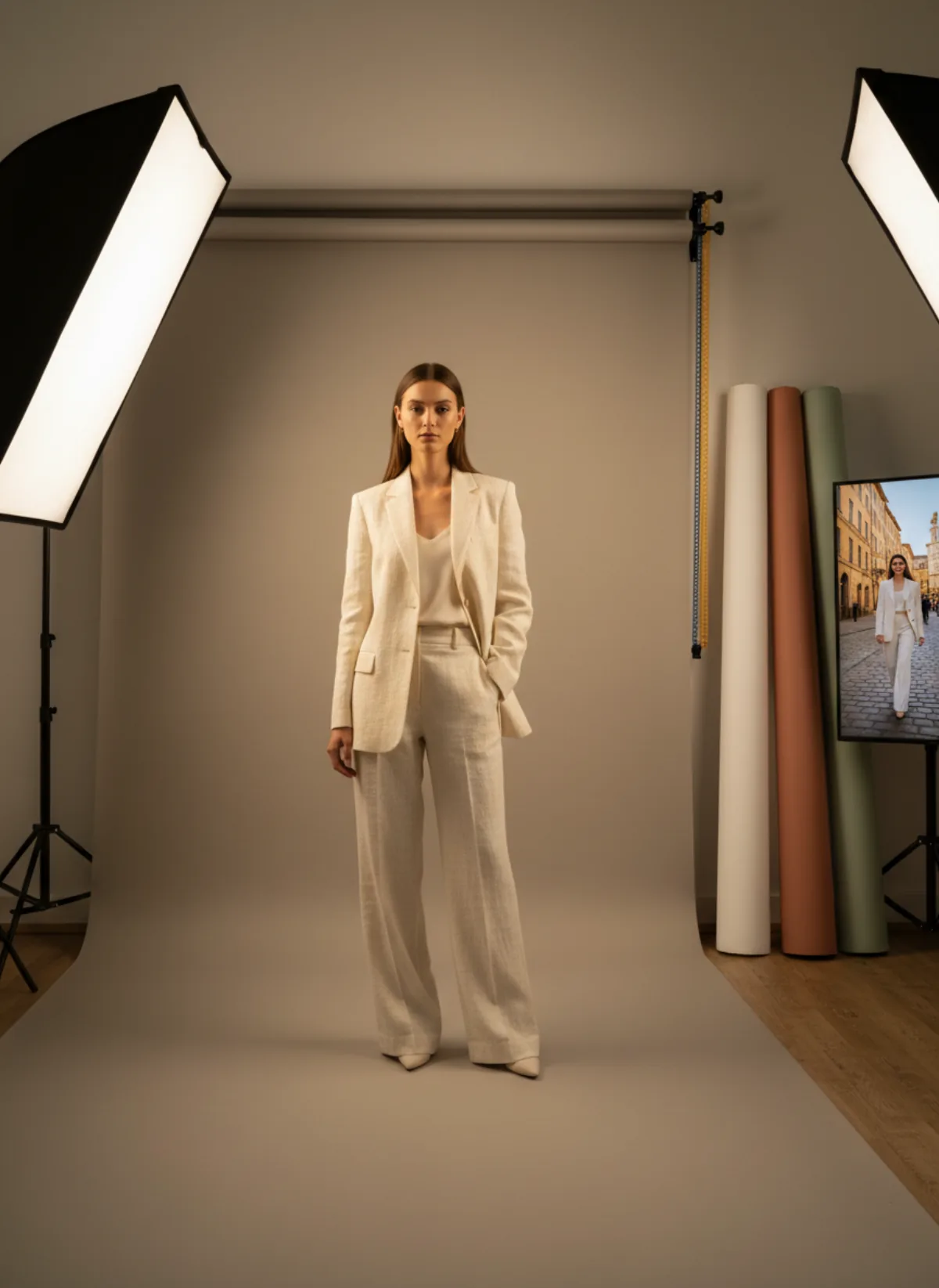
Seamless paper is the simplest studio solution because the floor curves into the wall without a visible horizon. Choose a roll wider than the model or product and pull it forward far enough to catch the full shadow. Paper gives consistent color but marks quickly under shoes, so cut damaged sections and record the roll name. A painted wall or sweep lasts longer; a board is practical for jewelry, shoes and tabletop objects.
Fabric can work, but it needs intention. Steamed muslin gives a soft field; deliberate folds can add texture to an editorial still life. Accidental wrinkles look like unfinished preparation and create dark lines that compete with small products. Matte materials are easier than glossy ones because they do not mirror lights or the photographer. If acrylic or polished stone is part of the concept, control its reflection rather than trying to remove it after the shoot.
Move the subject away from the backdrop when you want less shadow and more even color. Bring it closer when a grounded shadow is useful. Light the product first and background second: one large soft source can shape clothing, while a separate low-power light can even out the sweep. Watch the histogram, but also compare the file with the real item. A technically white background is worthless if the exposure washes out cream stitching or a silver edge.
Lock camera height, lens, subject position and crop for the catalog. Mark feet on the floor and save a reference frame for model scale. The method in the catalog photoshoot guide helps turn those decisions into a shot list. Consistency is especially visible on a collection page: a beautiful individual photograph can still weaken the grid if its horizon, shadow or body scale breaks the sequence. For bags, a sweep that curves from wall to table matters even more, as how to photograph handbags for sale shows.
Adjust the background for clothing, jewelry and shoes
Clothing needs separation along every edge. Black wool on charcoal loses the silhouette, while white linen on white loses sleeves and texture. Use a neighboring neutral with enough contrast, then keep the light directional enough to reveal drape. For a worn catalog, an AI product photography with models workflow can keep model, framing and background direction consistent across pieces, but every result still needs comparison with the source garment.
Jewelry is small, reflective and easily overwhelmed. A matte surface keeps attention on shape; darker tones can outline silver, pearls and clear stones, while warm pale tones often suit gold. Reflections become part of the background, so clear the whole room around polished pieces. Combine a detail photograph with a jewelry-on-model image to show scale, and never let a dramatic scene invent or hide clasps, settings or stone color.
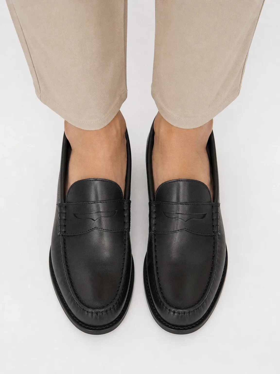
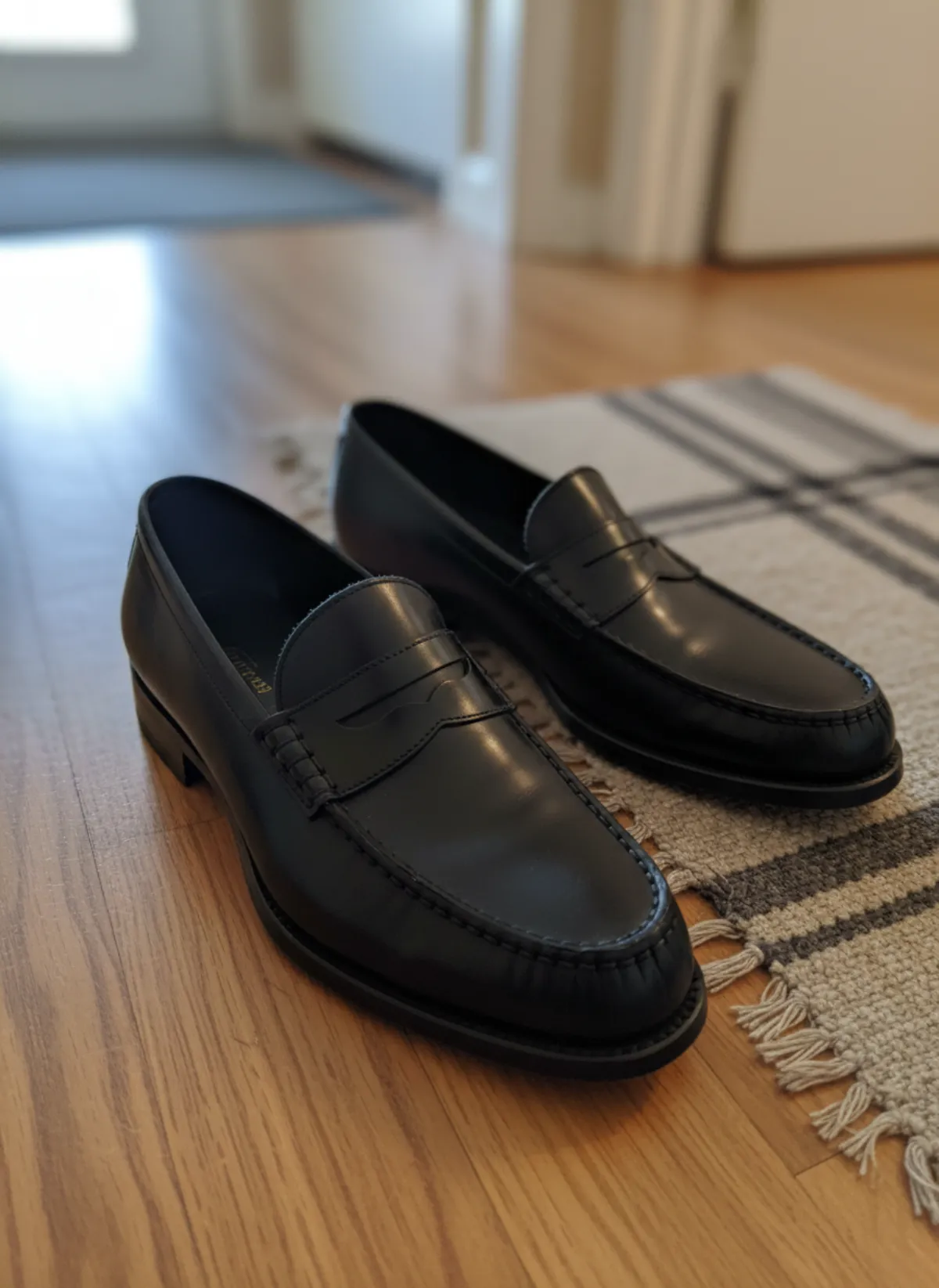
Shoes benefit from a visible contact shadow because it establishes weight and sole shape. Leave space around toe and heel for different crops, and avoid a floor color too close to the upper. Lifestyle frames may show pavement, a gym or an interior, but the surface must make sense for the product. The AI shoe photography tool can create worn views; use the clean product image beside them as the factual reference. For worn shots, the floor becomes the background; see how to take pictures of shoes on feet.
Whatever the category, evaluate the smallest collection thumbnail before approving the large hero. Fine props that look tasteful on a monitor can become noise on a phone. Squint at the frame: if the product no longer dominates, simplify. Then verify the selected ratio with the Shopify product image size guide or the requirements of the channel where the image will actually appear. For a WordPress shop, see WooCommerce product image size.
Change backgrounds with AI without changing the product
Start with a sharp, evenly lit reference in which all product edges are visible. Describe the set, surface, light direction and crop, but state that color, material, construction, print, fasteners and proportions must remain unchanged. Generate one or two approved directions before processing a range. If the first sample cannot preserve a striped repeat or asymmetric detail, more volume will only multiply the problem.
Compare output and source side by side at high zoom. Check collars, cuffs, hems, pockets, buttons, logos, jewelry prongs, shoe laces and sole geometry. Then compare color on a calibrated display if accuracy matters. AI may make a scene plausible while quietly smoothing texture or completing a hidden edge incorrectly. A pleasing picture is not yet an approved product photograph.
Keep the scene physically believable. Shadow direction must agree with the light, feet must contact the floor and reflective products must echo nearby colors. A consistent prompt is useful, but save the chosen output as a visual reference too. For broader guidance, the AI product photography for clothing guide explains a reference-first workflow and the checks needed before publishing.
Finally, assign each approved image to a channel. Put the clearest neutral frame first on a product page, retain detail and alternate angles in the gallery, and use stronger color or lifestyle versions for collection banners and ads. This hierarchy protects conversion while still giving the brand room to feel distinctive. Background choice becomes a repeatable merchandising decision, not a decoration added at the end.
Product photography background questions
What is the best product photography background?
For most lead listing images, white, off-white or light grey is the safest because it supports comparison. Use brand color and lifestyle scenes as additional campaign or gallery images when they do not obscure product detail.
Should a product background be pure white?
Not always. Pale products often need off-white or grey for edge separation, and a store may use a consistent neutral that suits its identity. Follow the sales channel's requirements and preserve accurate product color.
Which background material is easiest for beginners?
Seamless matte paper is predictable for people and larger products; matte boards are practical for tabletop work. Both are easier to light than glossy surfaces. Keep the material clean and record its exact color.
Can AI replace a product photo background?
Yes, when the source is clear and the result is checked carefully. Compare color, shape, fabric, hardware, logos, shadows and contact points with the real reference before publishing.
How many background styles should a product page use?
A useful set begins with one consistent neutral style, then adds detail and one or two context images. Too many unrelated scenes make the gallery feel inconsistent and can reduce trust.